Dashboard 诊断
目录
Dashboard 诊断
对并行代码进行性能分析可能具有挑战性,但 Dask 分布式调度器 提供的交互式 dashboard 使这项工作变得更容易,它可以实时监控你的 Dask 计算。Dashboard 是用 Bokeh 构建的,并在调度器创建时自动启动,返回 dashboard 的链接。
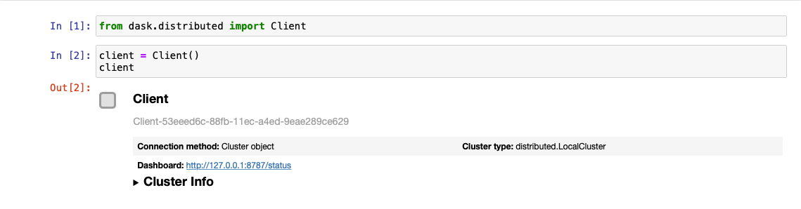
在本地,当你创建一个 Client 并连接到调度器时,就会发生这种情况
from dask.distributed import Client
client = Client()  # start distributed scheduler locally.
在 Jupyter Notebook 或 JupyterLab 会话中,显示 client 对象将显示 dashboard 地址
你也可以从 client.dashboard_link 查询地址(或者对于旧版本的分布式,client.scheduler_info()['services'])。
默认情况下,在本地机器上启动调度器时,dashboard 将在 https://:8787/status 提供服务。你可以在浏览器中输入此地址访问 dashboard,但如果端口 8787 被占用,可能会被重定向到其他位置。你也可以使用 dashboard_address 参数配置地址(参见 LocalCluster)。
有许多可用的诊断图。在本指南中,你将了解 dashboard 入口点上显示的一些最常用的图
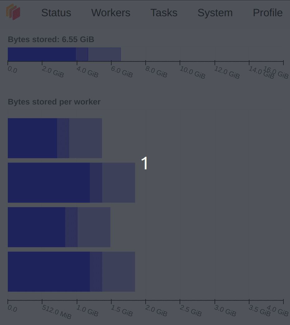
存储的字节数和每个 worker 的字节数:集群内存和每个 worker 的内存
任务处理/CPU 利用率/占用/数据传输:每个 worker 正在处理的任务/每个 worker 的 CPU 利用率/worker 上当前所有任务的预期运行时间。
任务流:跨线程的单个任务。
进度:一组任务的进度。
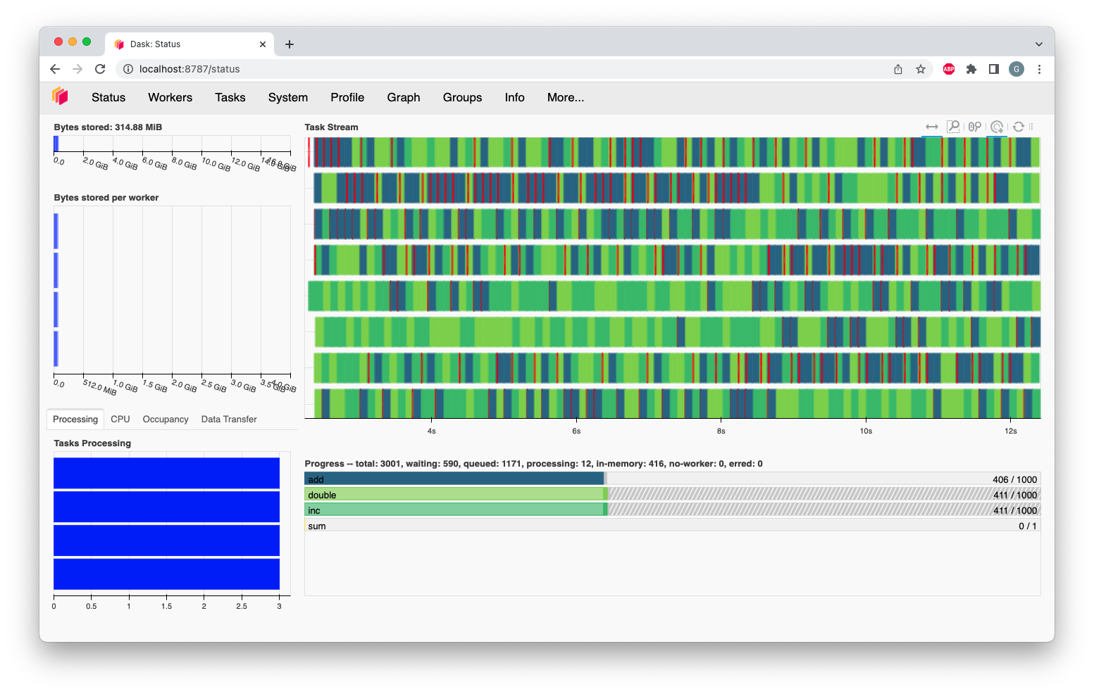
存储的字节数和每个 worker 的字节数
这两个图总结了集群的整体内存使用情况(存储的字节数),以及每个 worker 的个体使用情况(每个 worker 的字节数)。这些图上的颜色表示以下内容。
|
■
|
内存低于目标值(默认为可用内存的 60%) |
|
■
|
内存接近溢出到磁盘的目标值(默认为可用内存的 70%) |
|
■
|
当 worker(或至少一个 worker)暂停(默认为可用内存的 80%)或正在退休时 |
|
■
|
内存已溢出到磁盘 |
这些图的不同透明度级别与内存类型(Managed、Unmanaged 和 Unmanaged recent)相关,你可以在 Worker 内存管理文档 中找到详细解释
任务处理/CPU 利用率/占用/数据传输
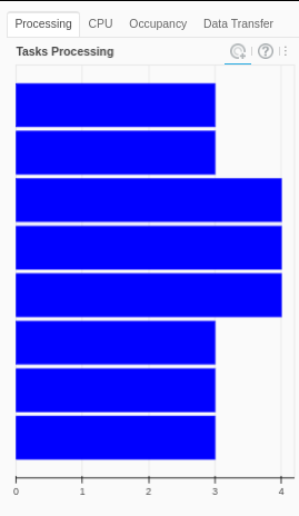
任务处理
图中的 Processing 选项卡显示分配给每个 worker 的任务数量。并非所有这些任务当前都一定在执行:一个 worker 一次只执行与其线程数相同的任务。分配给 worker 的任何额外任务将等待运行,具体取决于它们的优先级以及其依赖项是否在 worker 的内存中。
调度器会尝试确保 worker 处理的任务数量大致相同。如果其中一个条形图完全是白色,则表示该 worker 没有任务,正在等待任务。这通常发生在计算接近完成时(无需担心),但也可能意味着任务在 worker 之间的分布没有得到优化。
此图可能出现三种不同的颜色
|
■
|
正在处理的任务。 |
|
■
|
饱和:有足够的工作来保持忙碌。 |
|
■
|
空闲:没有足够的工作来保持忙碌。 |
在 dashboard 的此图中,我们还有两个额外的选项卡,包含以下信息
CPU 利用率
CPU 选项卡显示了由 psutil 指标报告的每个 worker 的 CPU 使用情况。
占用
Occupancy 选项卡显示了每个 worker 的时间占用情况。一个 worker 的总占用是指 Dask 期望运行所有任务以及从其他 worker 传输任何依赖项所需的时间总量,如果执行和传输是逐个发生的。例如,如果一个 worker 的占用为 10 秒,并且它有 2 个线程,你可以预期该 worker 需要大约 5 秒的实际时间来完成所有任务。
数据传输
Data Transfer 选项卡显示了每个 worker 与其他 worker 之间正在进行的数据传输大小。
任务流
任务流是查看每个 worker 的每个线程上运行的任务情况的视图。每一行代表一个线程,每个矩形代表一个单独的任务。每个矩形的颜色对应于正在执行任务的任务前缀,并与 进度图 的颜色匹配。这意味着所有属于 inc 任务前缀的单个任务都将具有相同的颜色(该颜色是从 viridis 颜色图中随机选择的)。
请注意,当一个新的 worker 加入时,它会获得新的一行,即使它是替换最近离开的 worker。因此,任务流上显示的行数可能暂时多于集群中当前的线程数,因为新旧 worker 的历史都会显示出来。
有一些颜色保留用于特定类型的操作
|
■
|
worker 之间的数据传输。 |
|
■
|
从磁盘读取或写入。 |
|
■
|
序列化/反序列化数据。 |
|
■
|
出错的任务。 |
在某些情况下,dashboard 的每个矩形之间会有空白。在此期间,worker 线程处于空闲状态。过多的空白表明资源利用不佳。此外,许多长的红色条形(传输)可能表示性能问题,原因可能包括块大小过大、图过于复杂,甚至调度选择不当。
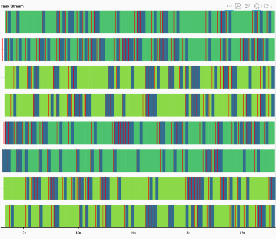
一个健康的任务流示例,几乎没有空白。传输(红色)很快,并与计算重叠。
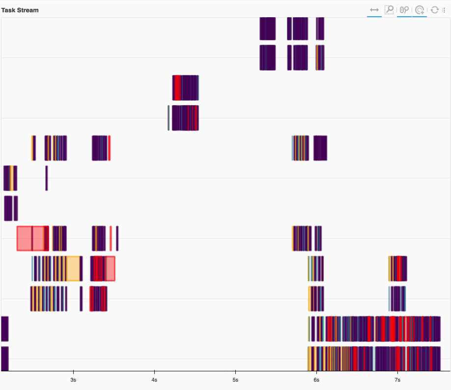
一个不健康的任务流示例,有很多空白。Worker 大部分时间处于空闲状态。此外,还有一些长时间的传输(红色),它们不与计算重叠。我们还看到内存溢出到磁盘(橙色)。
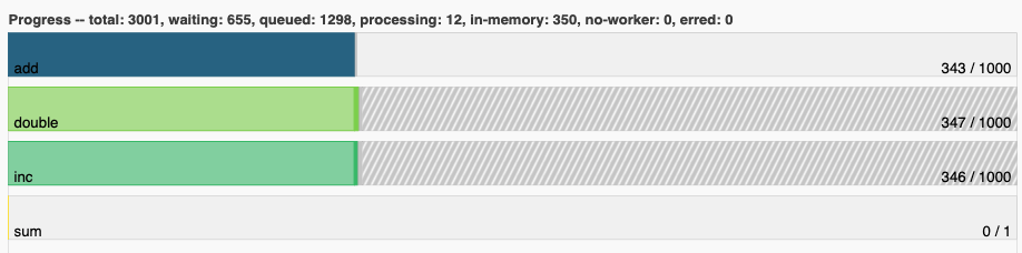
进度
进度条图显示了每个单独任务前缀的进度。每个条形的颜色与任务流中相同任务前缀的单个任务的颜色匹配。每个水平条形从左到右包含四个不同的组成部分
- 已完成、不再需要且已从内存中释放的任务。
- 已完成且在内存中的任务。
- 准备运行的任务。
- 已排队的任务。它们已准备好运行,但尚未分配给 worker,因此更高优先级的任务可以先运行。
- 由于限制或资源有限而没有 worker 运行的任务。
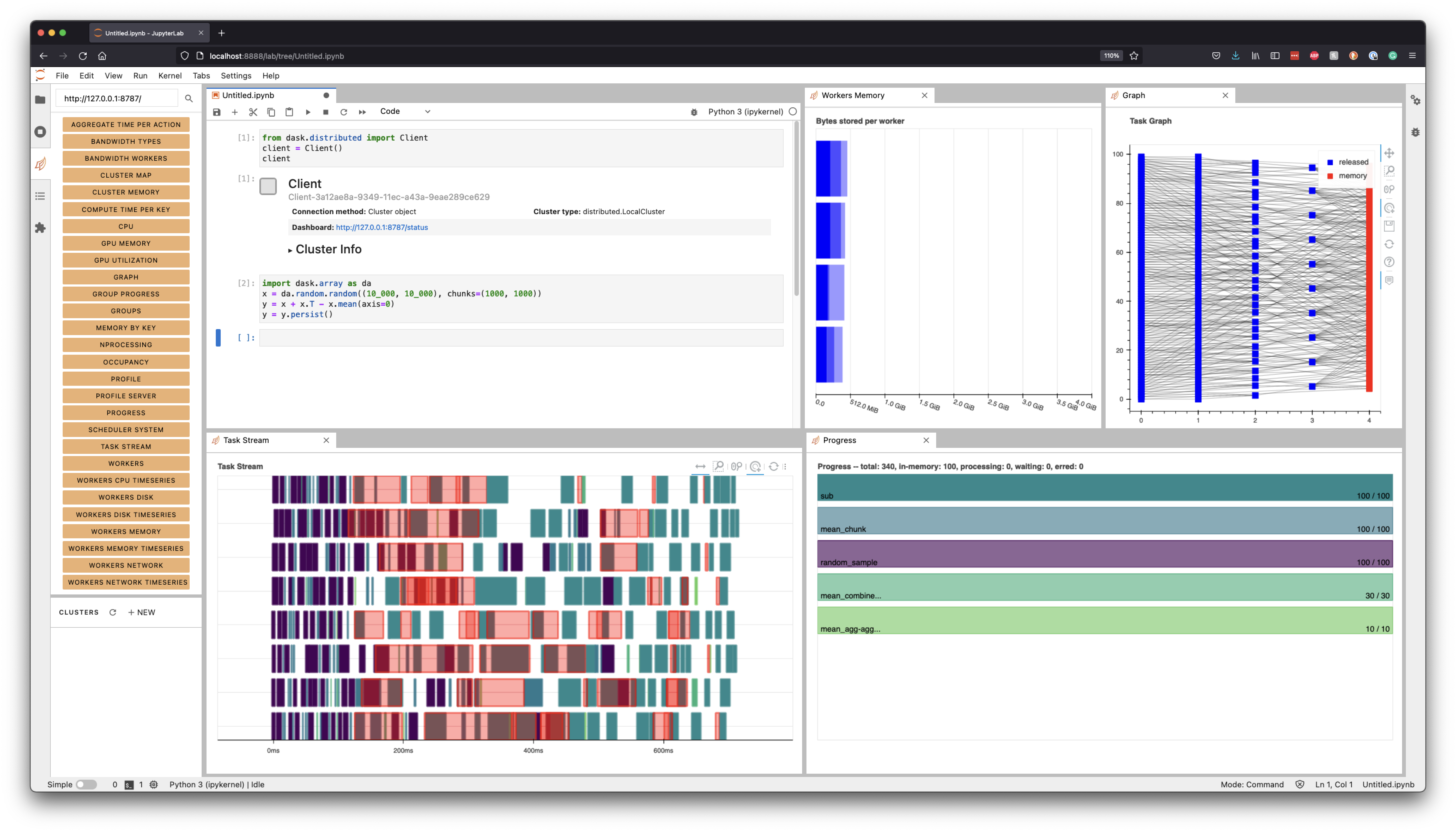
Dask JupyterLab 扩展
安装 JupyterLab Dask 扩展后,你可以选择任何可用的单独图并将它们集成到你的 JupyterLab 会话中作为窗格。
一旦安装了 JupyterLab Dask 扩展,你就可以选择任何可用的单独图并将它们集成到你的 JupyterLab 会话中作为窗格。例如,在下图中,我们选择了 Task Stream、Progress、Workers Memory 和 Graph 图。